The Jubilee Line Extension, Canary Wharf Station project has been named as the Best Transport/ Infrastructure building at the World Architecture Awards.
The awards are an important annual global recognition of architectural excellence. Organised by World Architecture magazine they identify the best buildings in the world.
Entries from around the world are split into seven regions, with up to five buildings shortlisted for each region. From these buildings the best buildings are chosen by category and from each of the regions. Over 400 entries came from 51 countries, and included a wide range of types and sizes of building; from some of the world's best-known international architectural firms to small one person practices.
Judging took place in March 2001 by a panel of leading architectural experts, drawn from all around the world. The architects of all the shortlisted buildings were invited to the awards ceremony in at the Hong Kong Convention Centre on 22 June 2001. The top prize of US$30,000 was awarded to Viiva Arkkitehtuuri for the Finish Embassy.
Judges said about Canary Wharf Station from World Architecture Magazine (July/August)
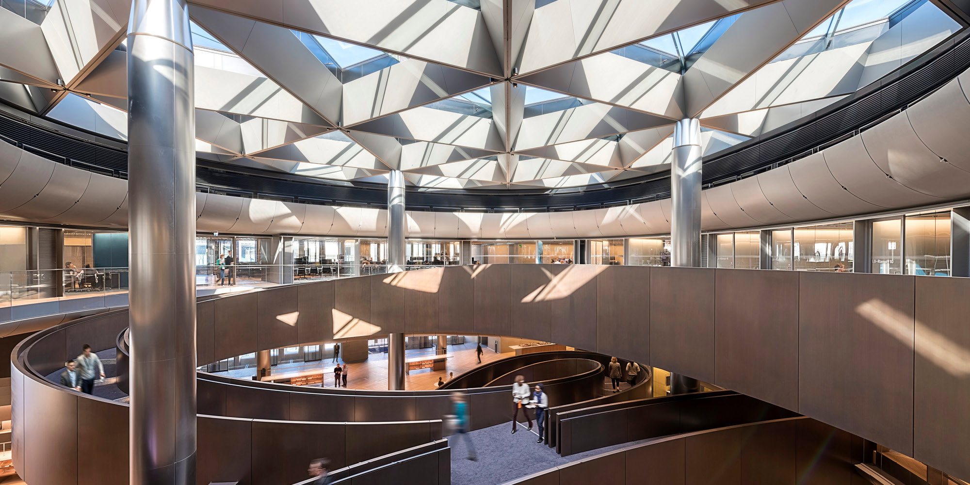
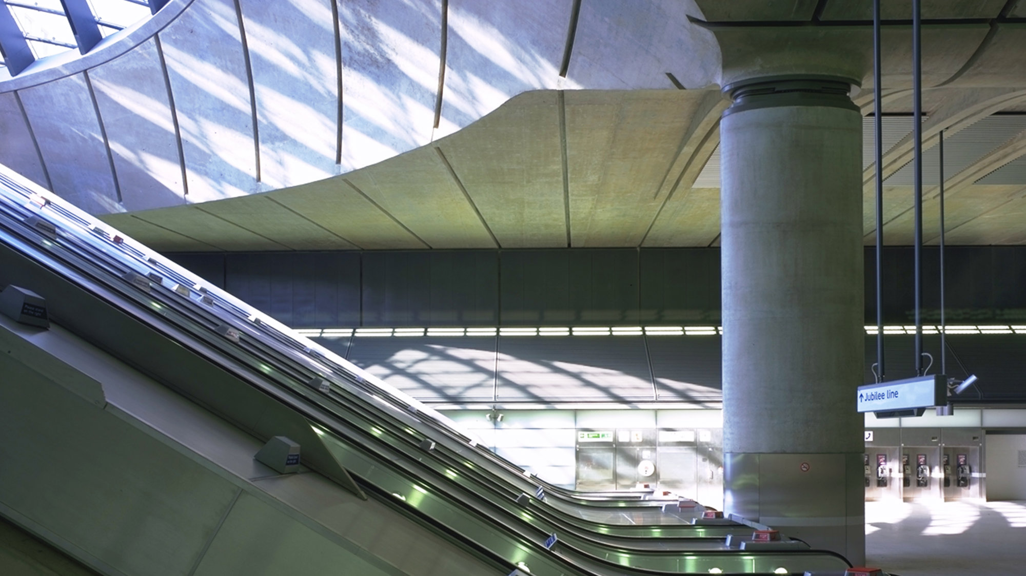
'Something every member of the jury agreed upon throughout the judging process was that architecture should be uplifting; the buildings should make people who use them feel better. This is certainly so with the new cavernous underground station in London's Canary Wharf by Foster and Partners. Tourists make special trips to stand at the bottom of the escalators, gazing up to the glass domes of the canopies over the three entrances, and signs have gone up entreating them not to take photographs at platform level.
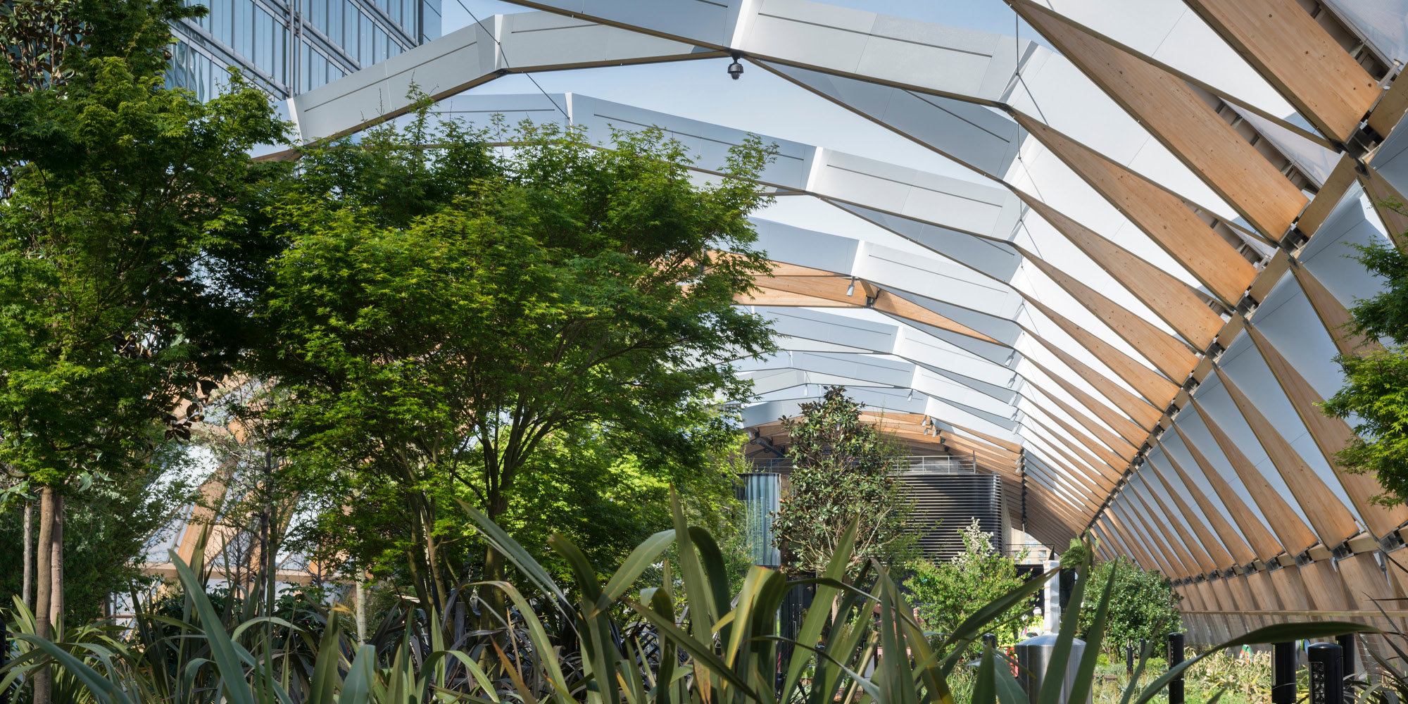
The station, one of the 11 new stations on the Jubilee Line extension, is built in the hollow of the former West India Dock using cut-and-cover construction techniques, with its roof a leafy landscaped park. The canopies glow with lightat night, indicating the entrances to the station, and by day they draw natural light deep into the station concourse. Administrative offices and kiosks flank the ticket hall, leaving the main volume free. The volume of passengers meant that the guiding principles were durability and ease of maintenance. The result is a simple palette of hardwearing materials: fair-faced concrete, stainless steel and glass.
