The venerable city of Philadelphia is one of the oldest in the United States and its evocative blend of diverse geography, artisanal heritage and urban vitality made it a potent muse for the design of the Four Seasons Hotel. Architect and interior designer for the project, Annamaria Anderloni, explains how, perched dramatically on top of the sixty-storey Comcast Tower, the Four Seasons Philadelphia puts the city on display.
31st May 2022
Interior Architecture of the Four Seasons Philadelphia: City, industry and ecology
City hospitality
“Foster + Partners reached back into Philadelphia’s legendary historical roots to give us a design that enables us to meet the challenges of the future.” Brian Roberts, Chairman and CEO of Comcast
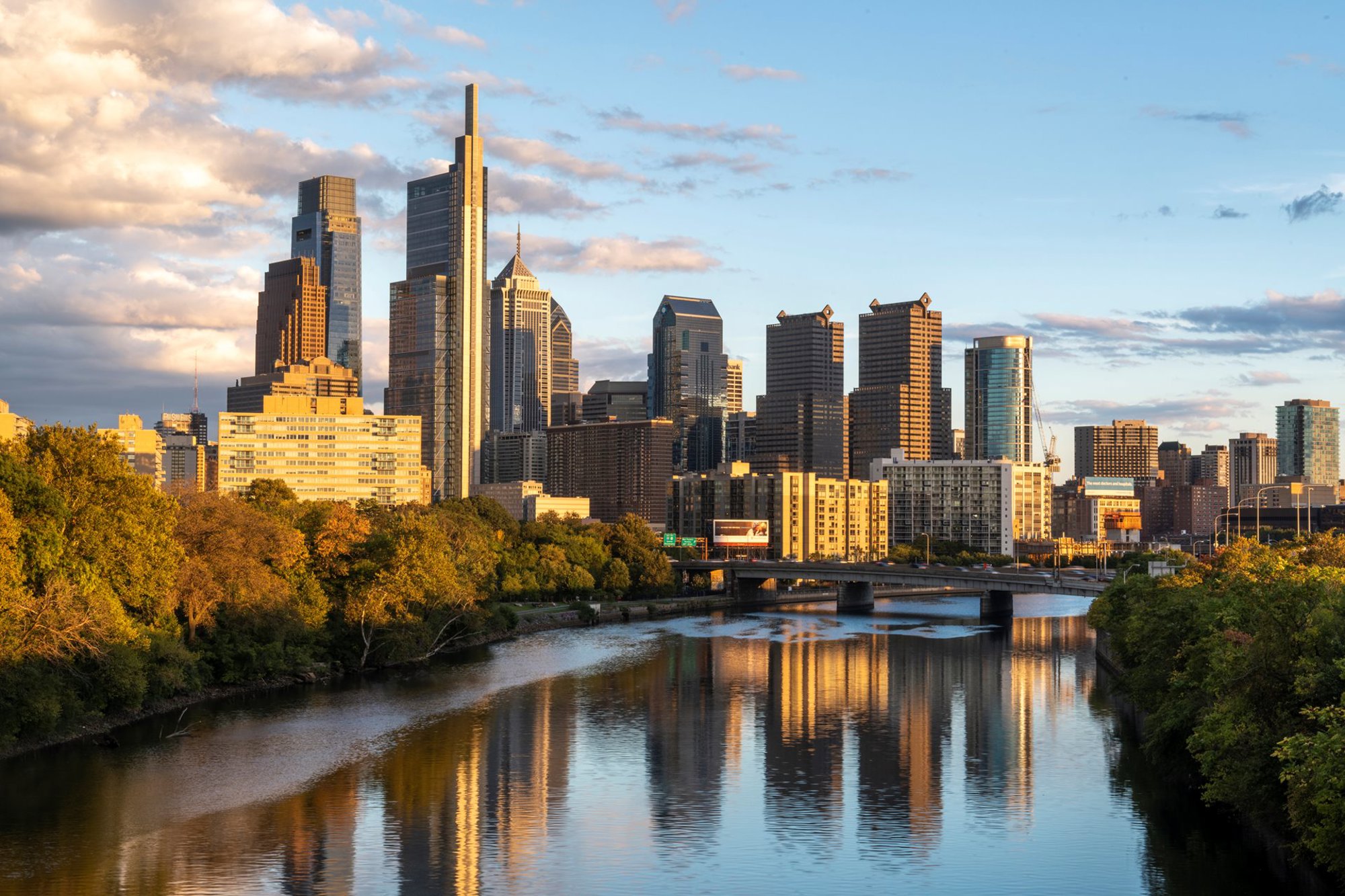
Foster + Partners’ Comcast Technology Center rises over 1,200 feet (340 meters) from a tight plot in a lively part of downtown Philadelphia, Pennsylvania. The 1800 Arch Street site is found between Rittenhouse and Logan Squares: residential and cultural districts, each anchored by their eponymous public spaces. The squares are two of five that were laid out from the city’s conception – set forth by founder William Penn in his seventeenth-century Center City plan for Philadelphia.
Penn’s Center City is a grid of long, broad and intersecting streets, stretching for about two miles between the western Schuylkill and eastern Delaware Rivers. The five public squares, so intrinsic to Penn’s plan for the city, were inscribed in maps for over a century before Philadelphia had grown enough for them to be built. Along with wide and tree-lined avenues, the open spaces were critical to Penn’s vision for a ‘green county town’.
The mixed-use Comcast tower is bringing life and activity back to Penn’s central streets, playing its part in the steady revitalisation of the urban centre of Philadelphia. The project is conceived as a welcoming addition to the neighbourhood, integrated with its shops, bars and restaurants.
Amid this street-side energy, is the entrance to the Foster + Partners-designed Four Seasons hotel. Our interior design team approached the project with a desire to create a range of spaces at different scales but within a cohesive set of design choices. Each would reflect and build upon the drama that comes from the hotel’s prime position in Penn’s Philadelphia.
At the same time, we were also keen to look further afield – out to the surrounding verdant landscapes and back in time to the city’s industrial past – to foster a deeper connection with place while also ensuring a truly restful guest experience.
The practice has always perceived the role of the hotel room, especially in busy urban environments, as an oasis of calm. Similar to residential developments, the architecture of hotels and resorts – our home away from home – demands a bespoke and integrated approach, where everything is considered and contextual, from the views to the quality of the finishes.
The practice has always seen the role of the hotel room, especially in busy urban environments, as an oasis of calm.
Sharing this sensibility was a set of committed and enlightened clients. The interiors were the result of a long and involved collaboration between Brian Roberts at Comcast and Dana Kalczak, vice president of design at Four Seasons, and their respective teams. Roberts was largely responsible for the vision, design, and overall aesthetics of the project while Kalczak and her staff supervised the operational aspects of its execution.
This partnership fed into a language of design that informs everything from the structure of the tower to the small interior details in each guestroom. All spaces feature diverting moments of surprise and intrigue that leads the visitor on a journey deeply tied Philadelphia and its history. Each piece of material, from the glowing onyx wall of the reception desk to the exposed birch wood and tactile leathers in the guestrooms, forms a seamless family of details that embody a quality connected to city, industry and ecology.
Framing history
The Four Seasons Hotel is a distinctly urban project but, perhaps the most unique and eye-catching feature of is its position in the city is that it’s sixty stories in the sky, above the grid and atop Philadelphia’s skyline.
A guest’s experience, however, begins at ground level, along the western edge of the building. Visitors are greeted at the concierge, with the animated sights and sounds of a new restaurant spilling out onto the street beyond.
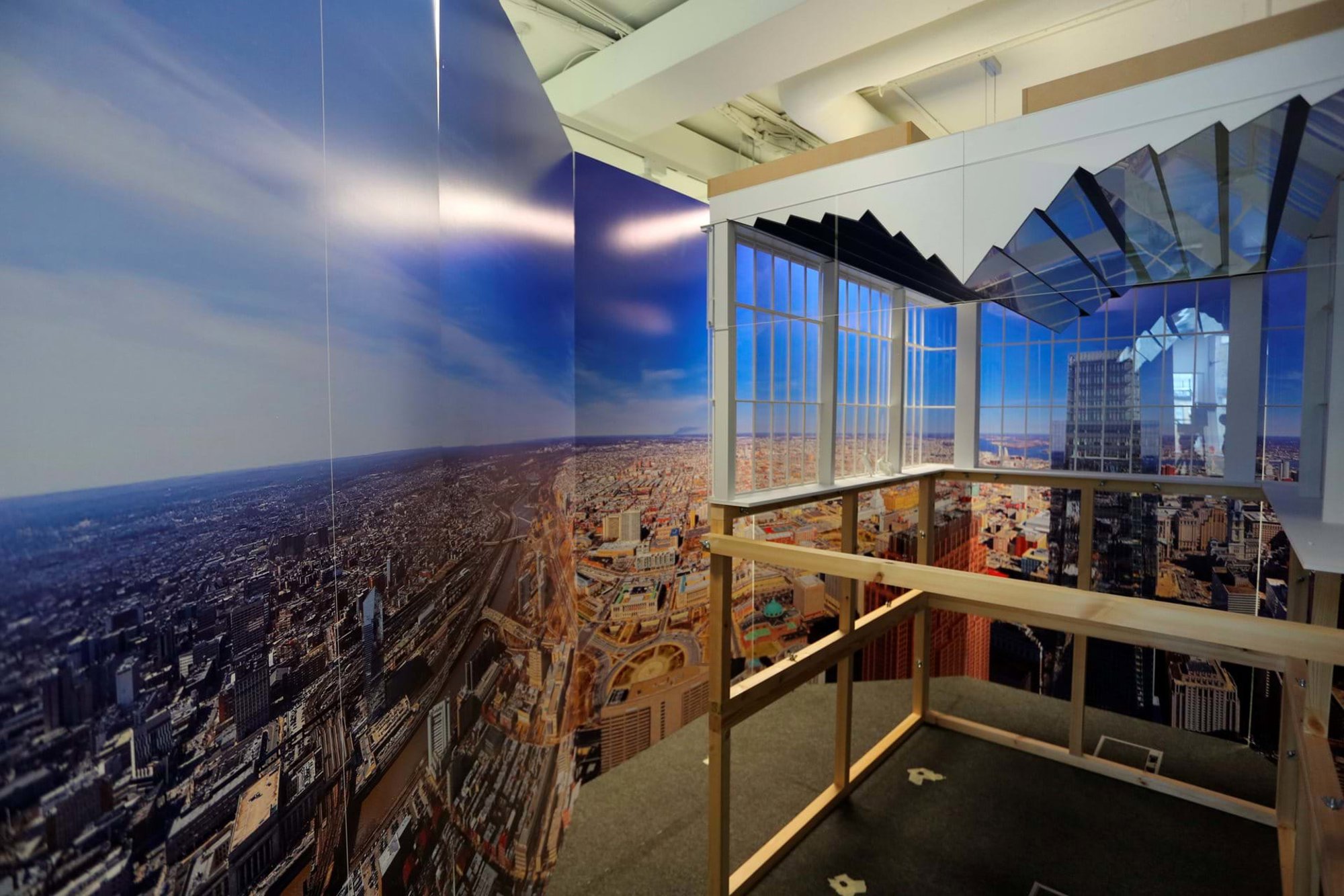
From here, the ‘conventional’ hotel experience ends. Glass express elevators rise out of the tower’s podium and along almost the entire length of the building’s north facade. As guests are sped away from the fabric of the city, an altogether different experience of Philadelphia is revealed, starting with stunning views of the urban surroundings and Penn’s Logan Square.
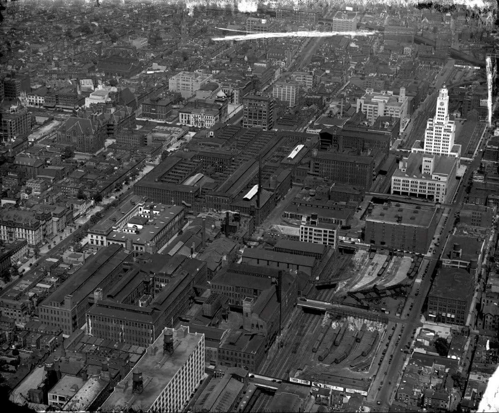
A view from the elevator ride up the tower’s north facade. In the foreground is Logan Square, at the north-west corner of the Center City plan. Stretching into the distance are the urban and suburban districts of Northern Philadelphia, once dominated by factories from the Industrial Revolution. At the horizon, these areas bleed into the largely flat and arboreal landscape of the Piedmont. © Nigel Young / Foster + Partners
Rise higher, and the edges of the rectilinear plan of Penn’s Center City come into view more clearly; a rigid, 480-hectare grid that demarcated an ideal port city employed by Penn to maximise commercial potential.
On a map of Pennsylvania, drafted in 1681 to entice potential investors, is inscribed all manner of trees found in the area – from ash and beech to pine and walnut. Such arboreal diversity is reflected in the name of the region itself, Pennsylvania, which means Penn’s woods. Of course, the verdancy signified not only a biophilic Eden but also an abundant construction and industrial resource: timber. A material that would be critical to the city’s early success.
As the elevators rise higher, views bleed from the edges of Center City into city regions of North Philadelphia – a less rigidly planned area, where once separate towns and villages were gradually consumed by the city during the nineteenth century. In this period, the lumber industries were overtaken and an industrial revolution saw Philadelphia become one of the most important centres of manufacturing in the world.
Perhaps the most unique and eye-catching feature of the Four Seasons Hotel in Philadelphia is its position, sixty stories in the sky, atop Philadelphia’s skyline.
North Philadelphia was shaped by this development and large factories, workers’ houses, and the wealthy estates of the industrialists began to emerge. The city hosted a variety of industries and businesses, the largest being textiles, but it also became known for iron, steel and railroad companies, like the Baldwin Locomotive Works.
We rise higher still and the horizontality of the Piedmont – a vast geological plateau in the Eastern United States, typified by small, isolated hills in an otherwise gently rolling plain – stretches northwards into view. These naturally forested hills are then abruptly interrupted by the grandeur of the Appalachian Mountains. Among the oldest mountains on Earth, the Appalachians first formed roughly 480 million years ago, and provide the region with not only spectacular scenery but also a unique diversity of mineral resources, including rich coal beds, veins of iron ore, salt springs and licks, and deposits of granite and marble that created major American industries in Pennsylvania.
As visitors reach their destination on the sixtieth floor, they have been witness to nearly half a billion years of natural history as they climb, not to mention the seismic impact of the human developments that have shaped the ecology, economy, industry and artistry of the region in the centuries following European settlement.
Such a rich history of ecology and urbanity provided the inspiration for a unique and exciting approach to interior architecture undertaken between the design teams at Foster + Partners and the Four Seasons.
Such a rich history of ecology and urbanity provided the inspiration for a unique and exciting approach to interior architecture undertaken between the design teams at Foster + Partners and the Four Seasons. Just as, with each passing storey, the glass elevators’ rise reveals new markers in the region’s timeline, so too do the design choices throughout the hotel connect the visitor quite deeply with the venerable city of Philadelphia; at every level, and in every detail, the city is on display.
A mirror to Philadelphia
Following the elevator journey, extraordinary views continue to define the hotel experience; during each stage of the design process, we have tried to convey an expanding of horizons – be that through the ten-foot floor-to-ceiling clearance in every room or the three-storey-high glazed infinity-edged swimming pool where guests can enjoy extraordinary views of the city below.
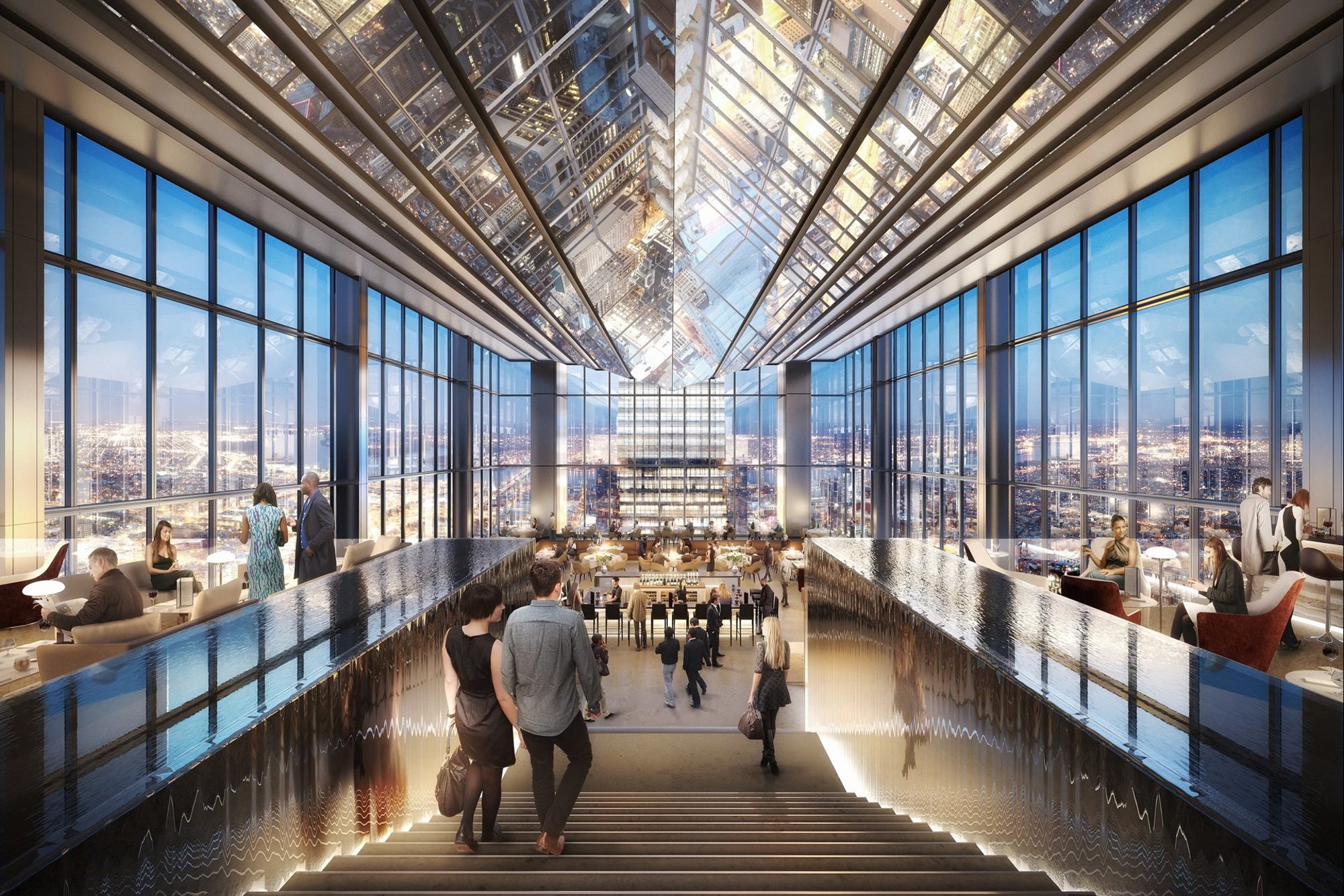
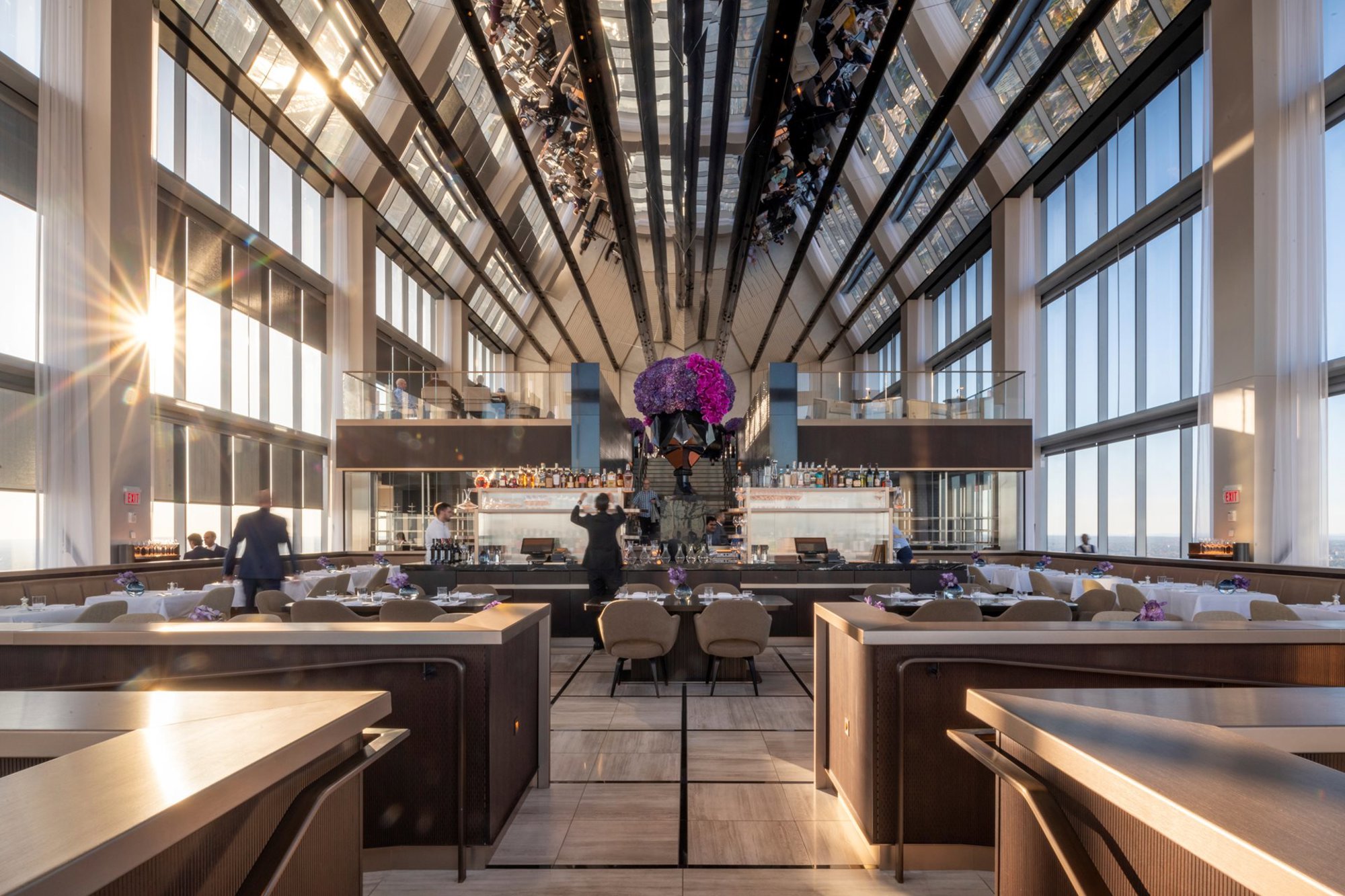
This unparalleled experience of Philadelphia reaches its apex in the striking triple-height restaurant, SkyHigh, which features a bespoke mirrored ceiling that reflects the city from all angles.
The origination of this design can be traced back to our very first experiences of Philadelphia. We were commissioned by Four Seasons to design the hotel rooms but, early on in the process, we presented one image to the client that captured everyone’s imagination. That visualisation showed a top-floor restaurant, enveloped not with clear glass, which would provide views up into open sky, but with a geometric shard of angled mirrors, projecting down into the space.
Initially this image seems counter-intuitive. At 30 St Mary Axe in London, for example, we placed the top-floor restaurant beneath a clear glass pinnacle, creating one of the most memorable spaces in the city. However, no two towers, and no two cities, are ever the same and the image of a restaurant in the clouds, roofed in reflecting metal was based on an immediate reaction by Norman Foster to the specifics of the site and the city of Philadelphia.
The team knew that, unlike 30 St Mary Axe, the Comcast Technology Center would be the tallest tower in its city; from its rooftop, your vantage point would be far above all surrounding buildings.
The nearest comparable tower in height would be the existing Comcast Center on the neighbouring site. Our design team would meet in the boardroom of this tower and Norman Foster remarked that, isolated at such a height, the view from there was predominantly of sky and horizon, not the city. The experience from the top of our new tower, he put forward, would be comparable, if not even more pronounced.
So, the team had a challenge: the site, firmly in Philadelphia’s historic Center City, is urban and the hotel experience should reflect that, but Philadelphia is not Manhattan, and we could not rely on a forest of similarly tall towers to add drama and context. We needed another way to connect to the city.
In the end, it wasn’t other towers that became our guide but much smaller-scale urban projects that played with light and reflection to capture their city contexts – we explored public pavilions in Marseille, contemporary interventions in historic Parisian courtyards and even urban furniture in New York, all of which manipulate views and share this language of refection.
The result was the visualisation presented to the client at that meeting – an image that proved so successful that the concept for the space was retained.
This unparalleled experience of Philadelphia reaches its apex in the striking triple-height restaurant, SkyHigh, which features a bespoke mirrored ceiling that reflects the city from all angles.
With the backing of the client, we were now able to investigate and develop the detailed design of the mirrored ceiling. The process of creating the final design consisted of in-depth research through sketches and models, using light to understand and create the meticulous angles.
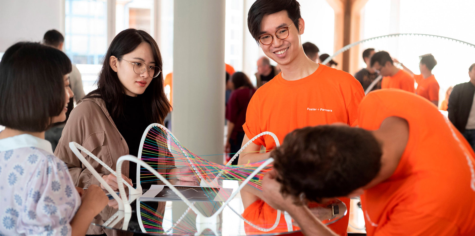
A model of the restaurant’s mirrored ceiling, measuring at least two metres long, was built in the Foster + Partners’ studio and surrounded by a printed panorama of the city of Philadelphia. Large enough to for several people to ‘inhabit,’ the model offered a verifiable experience to back-up the design intent. © Foster + Partners
At this point, we also drew on the mathematical and analytical expertise of the practice’s Applied R+D (Research and Development) team. The Applied R+D team created bespoke software for tracing millions of rays from a band of sky just above the horizon to the mirrored ceiling, which reflected these onward to a grid of points at the eye level of a seated guest (3.3 feet, or 1.2m, above the floor). Each time a pair of rays successfully reflected onto this “visibility grid” of eye-level points, the end point of the rays – horizon, mirror, eye – recorded this success. At the end of analysis, each option was judged based on its tally of successful reflections.
Additionally, there were perceptual issues to consider. For example, when a reflected view occurs at an angle greater than ninety degrees the reflected image appears to be upside down and can be disorienting. Multiple levels within the space meant that a single mirrored panel would have different reflective potential depending not just on a viewer’s location on the plan, but also their height.
The ceiling is a piece of art that provides guests with striking and ever-changing views from the warm glow of a sunrise to the electric evening skyline.
The ARD team worked with the architectural team to arrive at several proposals that would meet these practical constraints. These were then subjected to the computational analysis described above to understand which among these provided the best skyline views.
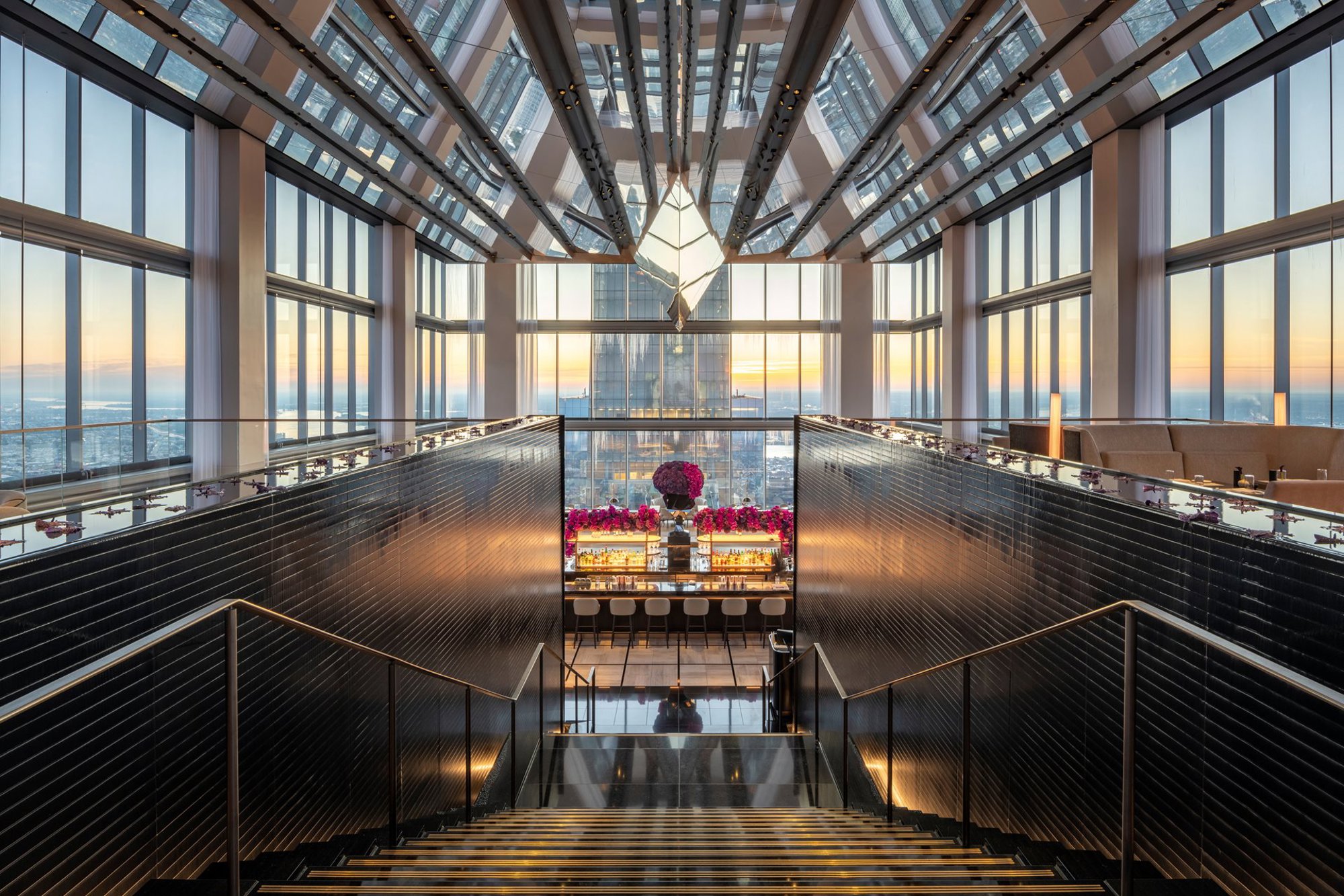
Moving in from the side wall, the mirrored bands drop progressively in height towards the floor. At centre, they culminate in an elongated triangular prism with steep, reflective sides and a sharp point that bisects the room about 23 feet (7 metres) above the floor. Moving past this line of symmetry, the bands ascend again toward the ceiling before terminating at the opposite glass wall. © Nigel Young / Foster + Partners
The final construction is a symmetrical arrangement of mirrored bands that run longitudinally from one end of the restaurant to the other. The bands are angled down from the ceiling and out towards the long all-glass walls. Despite dropping so dramatically into the three-storey high space, the mirrored surface makes the ceiling almost disappear; the effect is to lose the sense of there being a ceiling at all and feel fully immersed in the city, despite it being some sixty stories below.
The shifting reflections, together with a polished black stone floor and two black stone ‘water-walls’ that flank the monumental entrance stair, give the space an ethereal quality. The responsive, faceted bands refract the geometric sharpness of Penn’s definitive City Center plan, enhancing the effect of the grid through its abstracted, rectilinear shards of mirrored steel. The ceiling is a piece of art that provides guests with striking and ever-changing views from the warm glow of a sunrise to the electric evening skyline.
Our work on the Four Seasons interiors spanned six years, from 2013 to 2019, with a peak of seven designers working on the project and at least two on site throughout; together we designed around 200 pieces of furniture for the hotel.
The team wanted all the furniture to feel like it belonged to a single ‘family’. At the root of all these elements was a simple concept, one that was shared by the approach in the SkyHigh restaurant ceiling: to reflect Philadelphia and Pennsylvania in the interiors and bring the outside in. Not literally, like the restaurant ceiling, but through exploring material and artistic influences taken directly from the history of the city and state.
The industrial legacy of timber in the founding of the city, and the thriving Amish community that continues to employ centuries of timber architectural tradition across Pennsylvania, are referenced in several areas: from the curved birch wood walls that separate bath and bed spaces, to the warm and natural timber furniture.
As timber gave way to iron and steel during the nineteenth and twentieth centuries, so too did innovative metalwork industries begin to emerge. The Budd Company became industry leaders and developed a series of locomotives called ‘Zephyrs’ in the 1930s. Like the contemporary Airstream trailers, these futuristic-looking trains, whose silver steel bodies, sloping fronts and corrugated flanks spoke of speed and power, became hallmarks of American design and engineering. The sleek, shining lines of the mirrored SkyHigh restaurant ceiling are a not-too-distant descendent of this Philadelphia icon.
Despite the successes of titans like Budd, more typical of Philadelphia’s industrial heritage was the small to medium-sized manufacturers and, as historian Walter Licht sets out in his history of industry in the city, ‘artisan shops still dotted the landscape’ in 1850 and ‘production continued according to ancient craft practices and standards far into the twentieth century.’
As the artisans of that period would have done, Foster + Partners used locally sourced materials wherever possible, and local artists and communities have been championed throughout. We were able to find direct inspiration for our interior choices from some of the most notable artisans that evolved from Philadelphia’s industrial and artistic melting pot. The American woodworker George Nakashima established his practice in the tree-covered hills north of Philadelphia. Meanwhile, to the northwest of the city, the notable American furniture manufacture Knoll, founded by Hans and Florence Knoll in 1938, established its headquarters.
The team wanted all the furniture in the hotel to feel like they belonged to a single ‘family’.
These pioneers of mid-century design in America, who established themselves in Pennsylvania, became significant touchstones as we defined and developed the character of the hotel interiors with the Four Seasons team.
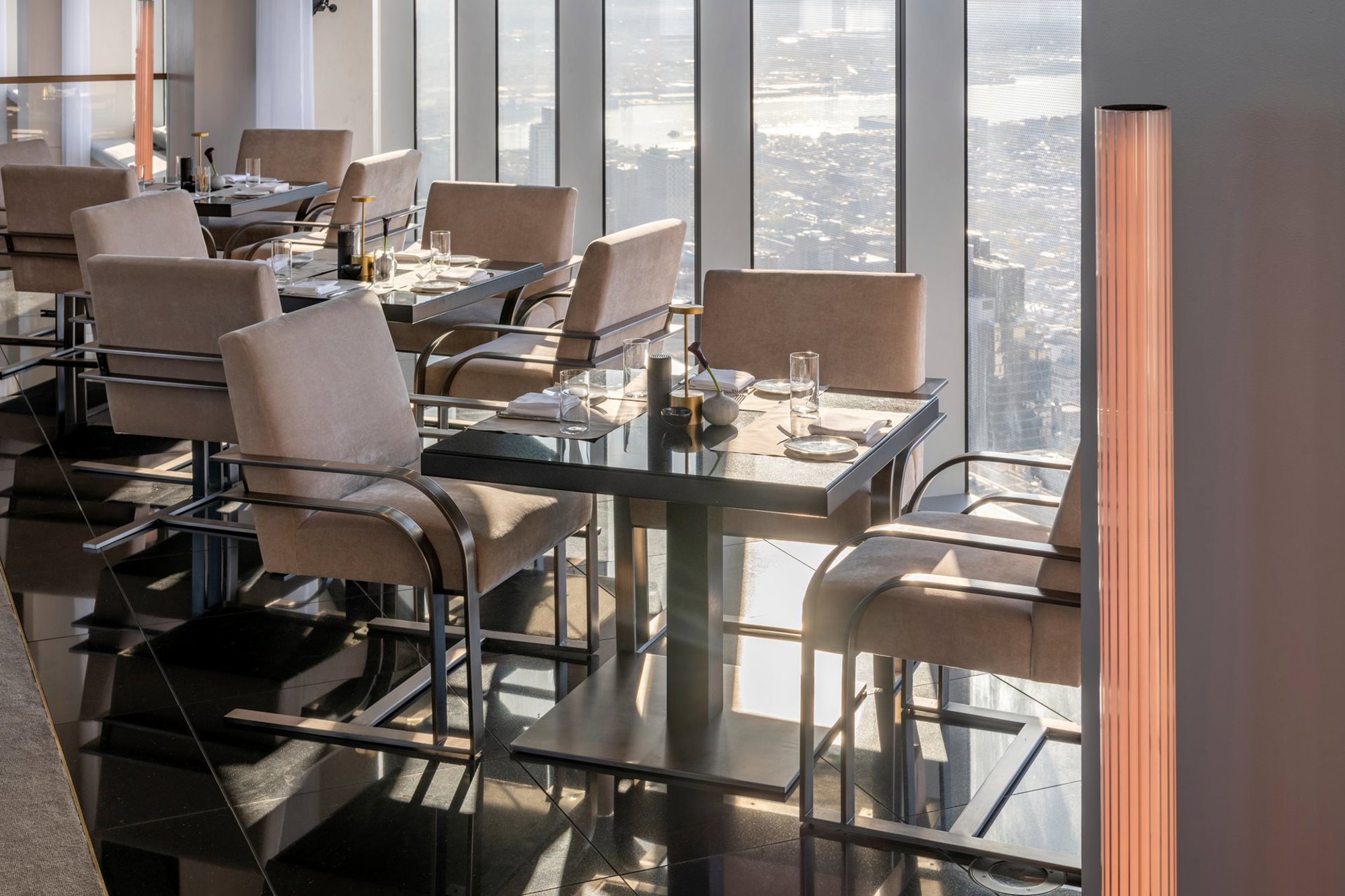
In the restaurant, for example, the material palette took cues from the Saarinen Executive Chair by Knoll, which was used throughout the space and originally manufactured in Philadelphia. The team matched all the timber elements in the restaurant back to the Saarinen chair’s legs, an unprecedented level of control and cohesive design across an interior.
In the same space, and beneath the same mirrored ceiling, the hotel’s lounge spans either side of the central staircase. Employing a similar material palette, the lounge appears like a dining space but is, in fact, scaled to a lower height, giving it a less formal air. It caters to guests looking for a casual environment throughout the day, from breakfast to dinner and drinks. The lounge is, both literally and figuratively, a bridging space, navigating between dining and office and tailored to business and industry.
The lounge interior was inspired by the aesthetic of the ‘power lunch,’ a design concept that is defined most memorably by Mies van der Rohe and Philip Johnson in their restaurant for the Four Seasons in New York.
With this classic Four Seasons reference in mind, the team developed a bespoke chair inspired by the cantilevering, hollow-profile metal Brno Chair by Mies van der Rohe, but updated with a lower, larger profile to achieve a height suitable for a hotel lounge. The chair features a twin structure of parallel metal elements, in place of the Brno’s single frame, to support the larger size and add an element of hospitality to it.
The unified language of material and detail used throughout the hotel, seen clearly in pieces like the lounge chair, marries tradition with innovation. The extensive family of interior elements and material choices, when taken together, encapsulate how the history of industrial invention, artisanal craft and artistic expression in Philadelphia were potent influences for our design team on the Four Seasons interiors.
Leaving the social and dining spaces at the roof of the building, a guest’s progress through the hotel continues its untypical journey. Instead of taking an elevator or stairs up to their room from the lobby, here a visitor will instead descend into the building, which features nine floors of guest rooms below the dining, fitness centre and spa levels.
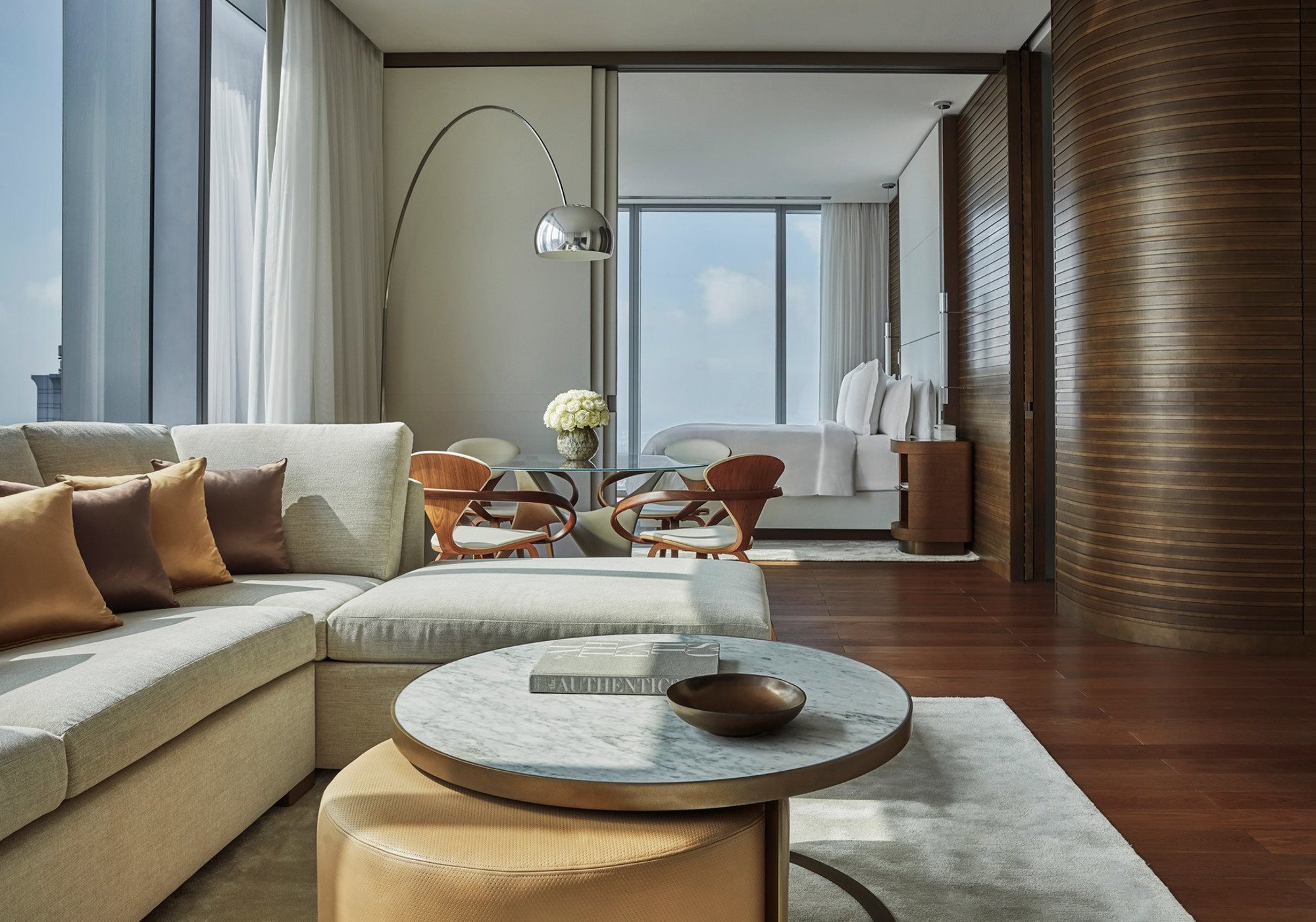
Despite this descent, most guests will remain over fifty stories above the city and the building’s all-glass facade is still the dominant architectural characteristic. The standard rooms are 430 square feet (40 square metres) and feel especially generous as we removed as much interference as possible to ensure guests can see right across their length. At 10.5 feet (3.2 metres), the ceilings are also particularly high for a hotel. This meant that large floor-to-ceiling windows would feature in every room with lateral views out over the landscape to the forested plains, hills and, ultimately, mountains or coastline of Pennsylvania.
Taking cues from this universal connection to nature, we specified a certain ecology of materials and open, naturalistic spaces for the various rooms and suites on offer. In the hotel’s circulation spaces, natural curves mark the entrance to every room to give the impression of a generosity of space in what are typically forgotten spaces in hospitality architecture – an organic language that continues in the interior layout of the rooms. Inside, all rooms have views through full-height glazing, and all have free-flowing, walk-in wardrobes.
The team specified a considerable amount of timber in the room’s design and fit out. We sourced local birch wood millwork for the curved walls that separate the various spaces in each room, and the furniture and homeware are crafted from a range of natural materials including stone, exposed timber, leathers, linens and soft cottons. The material selection contributes to a sophisticated yet comfortable aesthetic.
Pioneers of mid-century design in America, who established themselves in Pennsylvania, became significant touchstones as we defined and developed the character of the hotel interiors with the Four Seasons team.
As well as a material palette informed by nature, a sense of space and openness – more akin to a rural retreat than a downtown high-rise – pervades the rooms’ interior architecture. We went back to first principles on even the most elementary parts of the rooms’ composition. The wood-panelled wardrobe areas are bespoke and a far cry from the hospitality standard – sandwiched into a corridor between door and bed. The team devised them with a ‘gallery’ feel; we identified that it is your belongings that personalise a hotel room, if they can be on display then a much more potent home-away-from-home can be created. The end wall is also mirrored to increase the feeling of space and reflect views deeper into the room. It also allows the area to function as a dressing room adjacent to the bathroom.
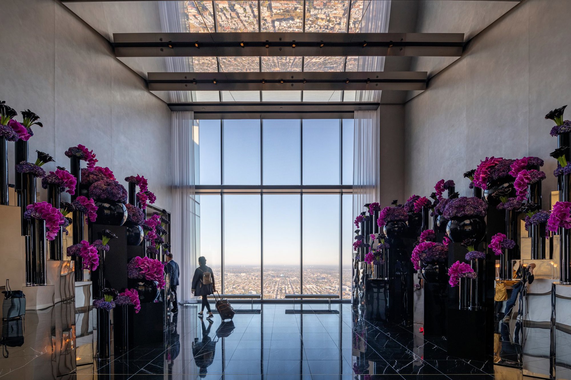
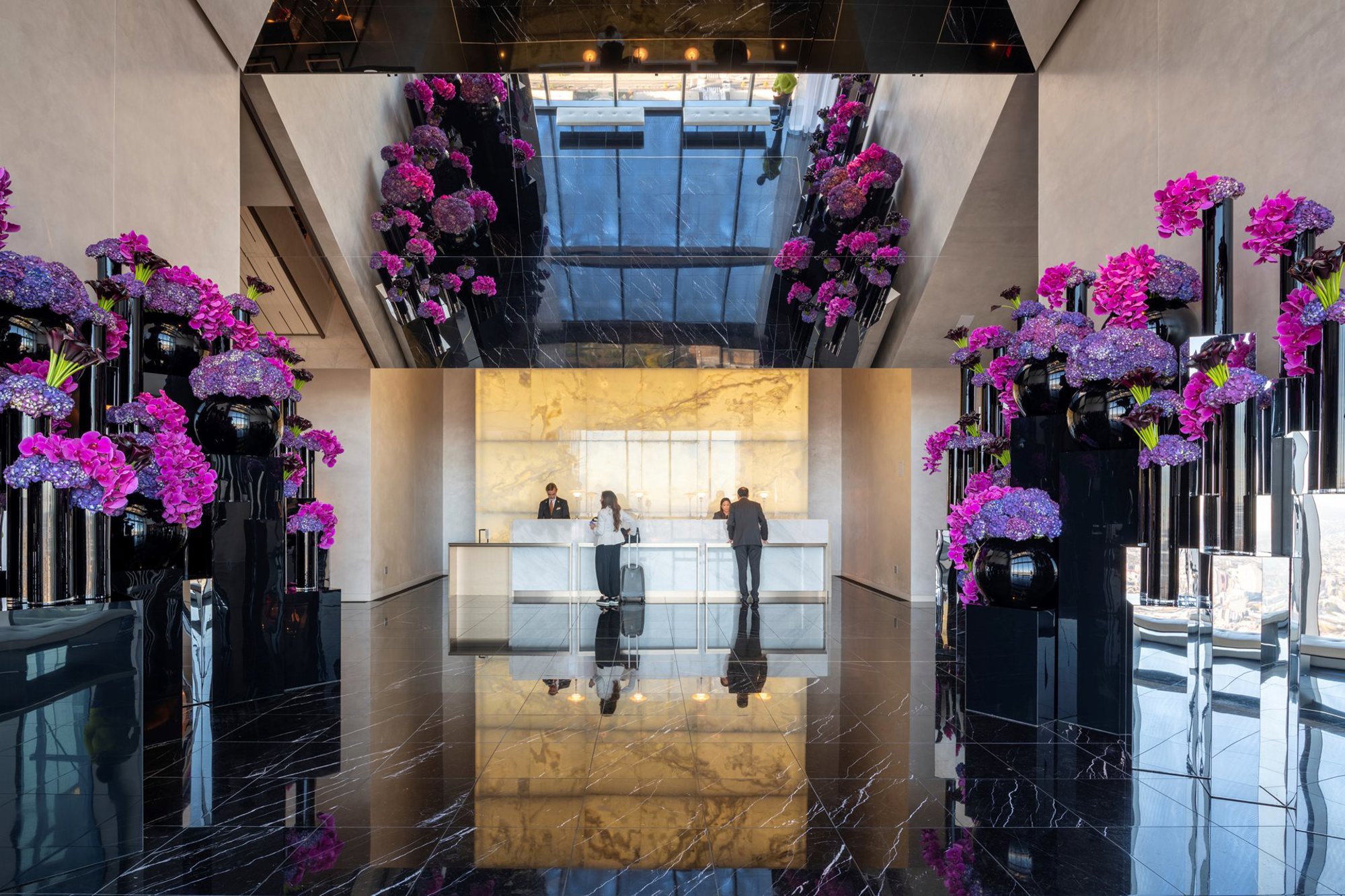
The guest rooms, and their spatial and material connection to the landscape of Philadelphia and Pennsylvania, were a defining part of the proposal for the hotel interiors, which embraced the notion of travel as a sensory experience. Indeed, each element in the hotel is designed to celebrate this – from the floral arrangements by American designer Jeff Leatham that line the reception area and route to the restaurant, to the world-class technology experience in the guestrooms, which reflects the incredible innovations created every day on the Comcast Center campus below.
We believe the architecture of hospitality – whether that is a hotel, resort or restaurant – demands an integrated approach, where everything is considered: from the views to the quality of the finishes. The design for the interiors at the Four Seasons was about creating the best hotel in Philadelphia, and at the heart of this is an integrated ecology of design that presents an inherent understanding of how the hotel responds to the needs of the guest – and how the guests’ senses will respond to the experiences of the hotel.
Architecturally, we wanted the experience to be exhilarating yet seamless – from the moment the guests begin at their street-level destination and are swept up the tower in all-glass elevators, to their arrival at a place far above the fabric of the city but inherently connected to it. This relationship between the hotel and Philadelphia – from its landscapes to its history – manifests itself in a holistic sensory ecology, from visual experiences, such as the incredible views and the sculptural, reflective ceiling installation, to tactile ones, such as the feel of the natural, locally sourced materials to the beauty of the bespoke-designed furniture.
The result we hope for is that visitors feel welcome and comfortable – as though they’ve stepped into a home away from home – while at the same time experiencing the excitement and intrigue of the elegant spaces that speak to the neighbourhood and city that is their new home for the night. This approach, encouraging a sense of familiarity with community and connectivity, is the emotional core of the Four Season’s interior designs.
Author
Annamaria Anderloni
Author Bio
Annamaria is a partner who specialises in interior design. She graduated in architecture and product design from the University of Turin and the ENSCI of Paris. She has extensive experience of working on hospitality, residential and corporate projects. Since joining Foster + Partners in 2007 she has been responsible for the interior design of numerous projects including the Four Seasons Hotel at Comcast Technology Center, ME Hotel London and Yacht Club de Monaco.
Editors
Tom Wright and Hiba Alobaydi
